At UWP we’re big fans of infographics. And what better way to ring in the new year than by looking back at some of the best infographics of 2016?
Infographics are a brilliant way to present information in an appealing and impactful way. They’re highly shareable, which makes them great for SEO.
Here are a few stats that illustrate why infographics are so effective:
- People follow directions 323% better when the directions are accompanied by illustrations.
- 40% of people respond better to visual information than plain text.
- After three days, people retain 10-20% of written or spoken information but almost 65% of visual information.
- Infographics are shared and liked on social media three times more than any other type of content.
We think those stats speak for themselves. So without further ado, here are 10 of the best infographics of 2016…
The Atlantic Slave Trade in Two Minutes by Slate

This wonderfully simple but incredibly impactful infographic maps the journeys of 15,790 slave ships over 315 years – in just two minutes.
It uses animated dots to show slave ships leaving Africa for the Americas and the Caribbean.
What starts as a few dots here and there soon turns into a steady torrent, instantly communicating the devastating scale of the trade and the destinations of the enslaved people.
It’s even interactive – you can pause the flow and click on the dots to learn about individual ships’ origins, destinations and history.
Whistle While You Work: Impact of Music on Productivity by WebpageFX

Most of us enjoy listening to music at work – but this infographic uses some hard-hitting stats to show it also makes us more productive.
Whilst there’s a lot going on here, the information is clear and well-spaced. The most important bits of information – like percentages – are given more prominence, which helps to direct our attention.
The combination of swirling musical notes, diagonal bars to separate the sections and splashes of bright colour make for an energetic, dynamic design.
How Elon Musk Started by Anna Vital
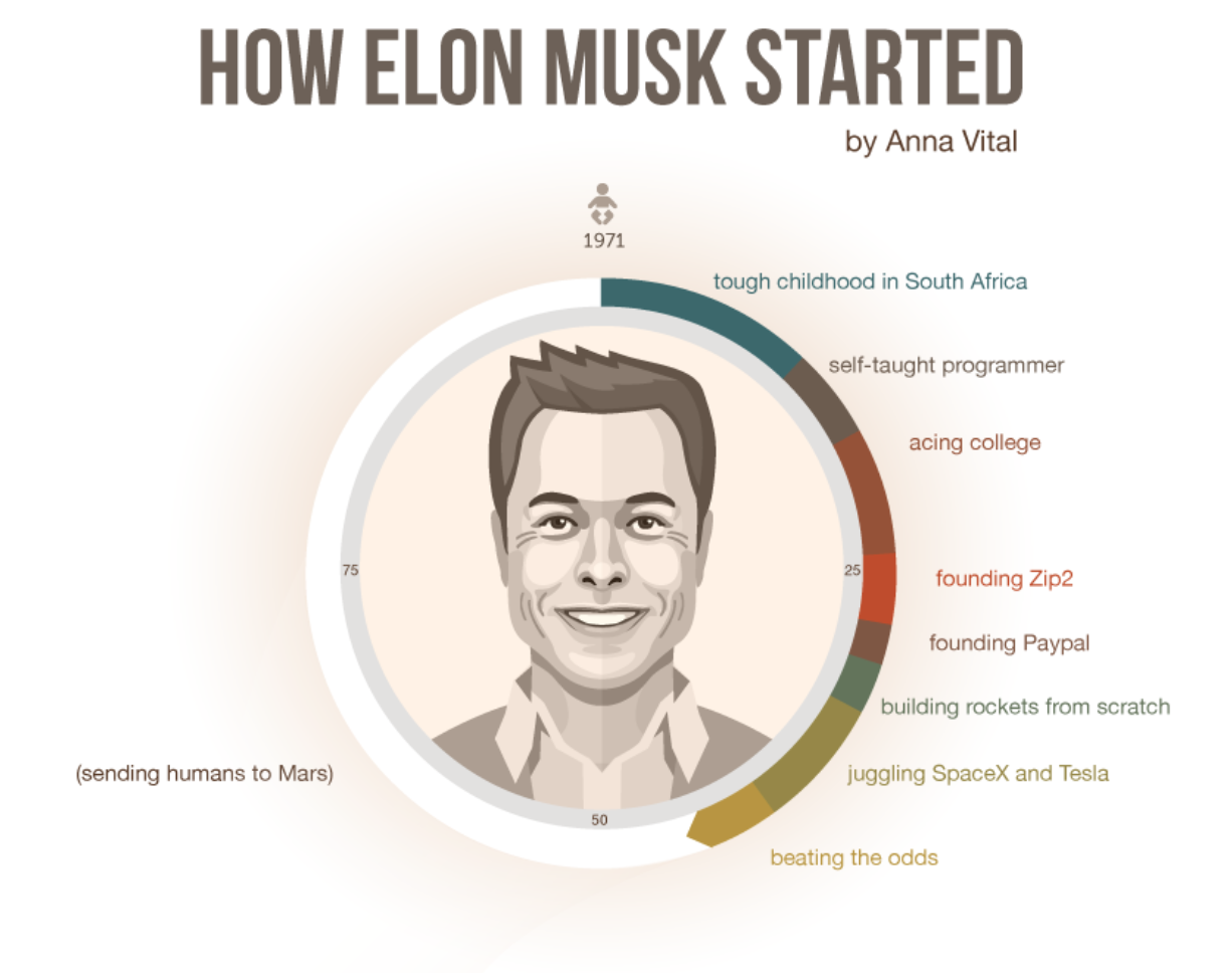
One of the best things about infographics is their ability to tell stories. This one tells Elon Musk’s remarkable life story, distilling it into a bullet-pointed visual biography.
Design-wise it’s very simple, but the short, snappy sentences and accompanying illustrations make it incredibly compelling – it’s hard to stop reading before the end.
The simple addition of a continuous zig-zagging line directs our attention through the story, as well as giving the design structure.
How to Avoid a Hangover by Fix
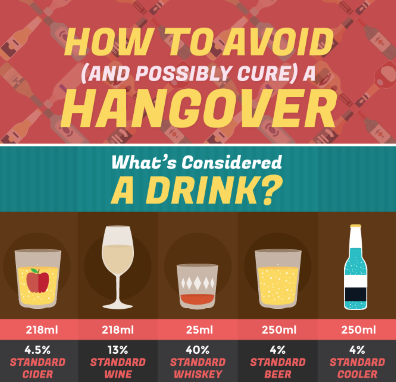
This infographic manages to pack in a huge amount of information, and the attractive colour palette and illustrations keep us engaged until the end.
The information is divided into sections, each one visually distinct but cohesive with the rest of the infographic, making it more palatable and easy to follow.
The fact that the subject matter is something most of us can relate to makes this super shareable. I mean, who doesn’t want to know how to cure a hangover?
Europe’s Migrant Crisis by the Numbers by Foreign Policy Magazine
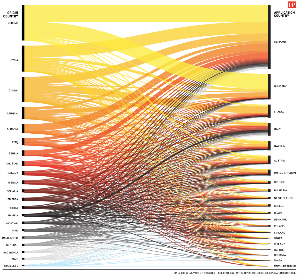
The best infographics convey a lot of complex information in an easy-to-digest way.
This diagram communicates the scale of Europe’s migrant crisis, and gives us an immediate impression of where migrants are coming from and going to.
The design cleverly differentiates the overlapping strands with subtle colour variations and semi-transparency, enabling us to follow the strands from beginning to end.
At a glance, we can immediately see that most migrants come from Kosovo and Syria and seek asylum in Germany and Hungary.
And Then I Backpacked Around Europe by Cheapflights

Again, this infographic manages to condense a lot of information into an engaging, easy-to-follow format, with illustrations that reinforce and clarify the handy backpacking tips.
It balances a subtle background colour with bright, eye-catching colours in the foreground to highlight important information – a key best practice for infographic design.
Most Decade-Specific Words in Billboard Popular Song Titles by Prooffreader

The power of this infographic lies in its ability to paint a bigger picture from what might otherwise be a fairly impenetrable set of data.
It uses information taken from song titles spanning more than a hundred years to show how our lyrical tastes and sensibilities have evolved during that time.
It makes for interesting viewing, and says a lot about how society has changed over time.
An Internet of Things Unsafe by Column Five/Neustar
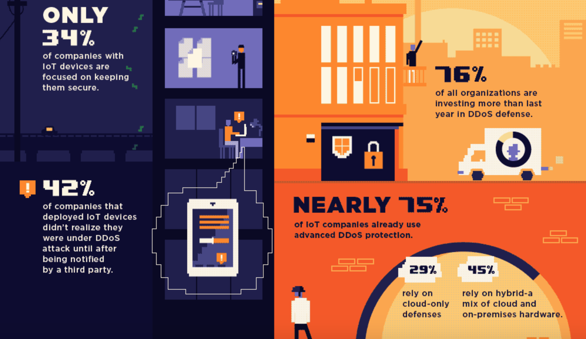
A bit of choice animation can be the difference between a good infographic and a great one.
This infographic uses animation to great effect. The animated elements are small and subtle, but they really bring it to life.
The fonts, illustrations and colour palette give a cheeky nod to retro video games, which juxtaposes nicely with the topic of future cybersecurity.
Smart Cities by Future Processing

This infographic uses a limited colour palette of greys, blues and white to give it a sleek, futuristic look.
Near the bottom, it incorporates a semi-opaque photograph of a cityscape as a background. It can be difficult to make photography work in an infographic, but this one nails it.
Overall, it does a great job of pulling together several different elements – illustration, text, diagrams and photography – into a coherent whole that really works.
9 Natural Ways to Cure Jet Lag by Expedia

The vibrant, contrasting colours in this infographic make it bold and eye-catching, and the retro comic book style of the heading is instantly engaging.
The design incorporates two different fonts, both simple and easily legible. According to Kissmetrics, poor font choice is one of the most common infographic mistakes – but this one gets it just right.
10 of the best infographics of 2016 – a summary
We hope you’ve enjoyed our roundup of some of the best infographics of 2016.
In our opinion, it’s not hard to see why infographics are so popular – they condense detailed information and statistics into an engaging, easy-to-swallow package.
We’re looking forward to seeing lots more great examples in 2017 – and we’re working on a few ourselves as we speak so watch this space!
If you’d like to know more about infographic design, get in touch with us today – we’d love to chat.