Looking to create the perfect website – a website that all your potential customers will adore?
You’ve come to the wrong place. I hate to break it to you but no such place exists.
There is no magic wand you can wave to ensure everyone falls head over heels in love with your site and buys into your brand or products as a result.
One man’s meat is another man’s poison and all that. Sorry – don’t shoot the messenger.
However, what you can do is play the percentages to make sure you maximise your chances of impressing people, while getting your message across as clearly and efficiently as possible.
The experiences of others can give you a massive head start so we’ve done the research and put together ten top tips to ensure you give the people what they want (or most of them anyway):-
1 Left is right and right is wrong – when you lay out your pages
Jakob Nielsen’s 2010 eye tracking study found that web users spend 69% of the time viewing the left half of the page.
He recommends Western websites showcase their key content there as a result. By and large the opposite would apply to sites that are read the other way round, such as Arabic or Hebrew sites.
However, there’s more: Nielsen – and others – have also found that web users tend to concentrate their reading in an F-shaped pattern with the bulk towards the top left of the page. That area is crucial so use it wisely.
The F-shaped reading pattern. Source: Nielsen Norman Group
2 Navigation and the three-click rule – all is not what it seems
The three-click rule suggests readers will click a maximum of three times to find crucial content on your site before losing patience and leaving – but various surveys cast doubt on this.
Joshua Porter argues there is no magical number where people drop off – many keep clicking well into double figures. What is important is that they keep progressing towards their goal with each click so simple, sensible navigation is vital.
Next they will be saying the three-second rule about dropping food on the floor is wrong. Then I just won’t know what to believe.
3 Make things as easy as possible for the reader
Simple, prominent, call-to-action buttons are proven to work and search boxes, while not everybody’s cup of tea, are another option well worth considering. Pop-up ads, meanwhile, are nobody’s cup of tea, so are well worth not considering.
Most web users visit web pages to find out information – not give it – so avoid over-the-top registration forms like the plague.
Keep your mandatory fields to an absolute minimum, drop everything else – or make it optional – and have an intelligent auto-complete system that takes the strain off the reader.
4 Chop, chop – the quicker the better
This probably won’t surprise you but the slower your site is, the more it will turn users away – that’s official.
A survey by Bing – Microsoft’s search engine – found that slower websites mean diminished user satisfaction, fewer clicks and reduced revenue per user. Shock horror.
Roughly 40% of people abandon a website that takes more than three seconds to load. There are various ways to speed up your site. Here are a few to get your teeth into.
5 Get your copy right – and make it easy to read
The wording on your site will almost certainly play a huge role in selling your company or products so get it right – right down to the last apostrophe. Mistakes will make you, your firm, your products – or all three – look amateurish.
Web users generally skim read and only take in less than a third of what’s written so demonstrate value, avoid confusing jargon and don’t write any more than you need to.
Break things up with headings, bullet points, pictures, links or video and aim to use short, snappy paragraphs that are easy on the eye. Research shows this works.
And blog regularly – companies that blog typically get 55% more visitors to their site. That knowledge is power chaps and chapesses – use it.
6 Try different colour schemes
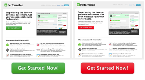
In a much-quoted example, US marketing company Performable – now part of Hubspot – turned a green call-to-action button red and got 21% more conversions. Food for thought.
Different colour schemes are scientifically proven to bring out different emotions – but what works for men doesn’t always work for women and vice versa.
Short answer: We’d recommend plenty of trial and error before your site goes live – a colour change can take seconds but make the world of difference. Even shorter answer: Everyone likes blue, apparently.
7 Don’t clutter your pages
The more elements you try and squeeze into each page, the less prominence you give to each of them.
Blogs aside, try and keep to a maximum of three major features or pieces of information per page – if there’s too much to take in readers are often intimidated or just give up.
Research also shows that users find it harder to understand what you are saying if the text is crammed in too tightly without an appropriate border. So let it breathe.
8 Substance over style – if you have to choose
Ah yes, the age-old conundrum. You want your site to stand out but it can be hard finding the right balance between look and functionality.
Hard one to test, this, but web surfers have notoriously little patience and – having suffered the pain ourselves more than once in the past – our advice would be as follows:-
Above all else, make sure you are crystal clear about what you provide and how users can get their hands on it. If that needs to be at the expense of quirkiness then so be it.
9 Make sure your site works on all major browsers and devices
There’s no point having an all-singing, all-dancing website that looks great on your laptop but doesn’t work on a Blackberry or the latest iPhone.
This isn’t always as simple as it seems so test, test and test again before you go live. There are packages you can use to help with this.
Likewise, test across all browsers. Latest figures show Google Chrome leading the way, catering for just over 30% of UK searches – with Internet Explorer 9 clocking up just over 20%. However, that still leaves nearly half the market share. So get your bases covered.
10 Get found
Apologies for stating the bleeding obvious but a great site that no one ever visits isn’t worth the paper it’s not written on so all the above is pointless without effective search engine optimisation.
How do you optimise your site to impress search engines like Google? There are dozens of tricks of the trade, from clean code to pictures and video with accurate tags, from relevant copy to useful links.
There’s a lot to take in but check out here for a taster: https://www.uwpgroup.co.uk/seo-agency-london/ or give us a call on 0207 100 4562 if you’d like to know more. We’d love to hear from you.