Worried your website isn’t pulling its weight? Read on for some tips on how to increase conversion rate on your site.
And to hammer the point home we’ll chuck in a case study where we more than doubled conversion rate for a client. You can’t say fairer than that.
Let’s start at the start.
A client of ours is an insolvency practitioner. We run AdWords campaigns for them and regularly check their Analytics so we know how many people visit their site and the proportion that convert into customers.
I’ll cut a long story short – it wasn’t enough.
The site was clean, modern and professional and feedback has been good. But it wasn’t converting enough visitors into paying customers.
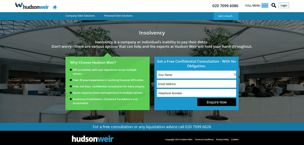
The landing pages looked like this – have a think what you’d change, then we’ll tell you what we did:-

What was wrong with the old landing page?
In our humble opinion, this page was not at all far away so we didn’t want to rip it up and start again.
It’s got five key USPs front and centre in bullet points and all the major features were visible above the fold on all major devices.
There’s a clear and simple contact form to the right and two prominent phone numbers as an alternative option.
So far so good. But it wasn’t driving enough custom. So we scratched our heads and came up with a five-point plan that seemed to do the trick.
Five key changes that have improved conversion rate
1. We’ll start off with a biggie – industry accreditations. There were no badges visible to convince potential customers that Hudson Weir are a safe pair of hands.
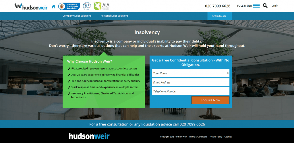
Easy fix – we included a handful of the most relevant accreditations from the likes of the Insolvency Practitioners Association, made sure they were visible in the header and job done.
2. Next up is the “enquire now” button. It was black and fitted in nicely with the colour scheme of the site – but almost too nicely, almost merging into the background.
We prefer our calls to action to pop out of the page so we used an orange – a colour that is proven to perform well for CTAs.
3. Text colour. While we are on the subject of colour, we changed the colour of the white text on the green background.
We surveyed a few dozen people and while 80-85% found the colour scheme fine, roughly one in six struggled to read it. A reminder not to assume that everyone feels the same as you!
4. Turning bullet points into ticks. This is a handy trick that we’ve had success with in the past. Bullet points are a great start in their own right – far more digestible than big blocks of text and easier on the eye.
However, from our experience, a tick rather than a plain circle adds an element of reassurance. Whatever the psychology behind it, the results speak for themselves.
5. We’ve saved possibly the most important change for last.
Site speed is crucial – according to research a one-second delay in page-loading time can reduce the number of page views by 11% and conversions by 7%, while 40% of searchers will abandon a page if it takes more than three seconds to load.
We felt the site wasn’t running quickly enough and worked hard to optimise it, slashing the page load time in half.
Now the page is a lot quicker and it looks like this:-

What were the actual results of our changes?
It’s fair to say our changes had a massive impact on conversions. In the month that followed the amendments to the landing page, we saw an increase in enquiries of almost 400%.
The key take home? A landing page is only as strong as its weakest link.
We reckon the page was about 85% there to start with, with decent calls-to-action, bullet points and contact forms so it wasn’t time to rip up and start again. As you can see we’ve only tweaked at the edges.
However a couple of key issues were limiting its effectiveness and some small changes have made a huge difference.
How to increase conversion rate on your site – a summary
The Hudson Weir case study reinforces our belief that even small changes to a landing page can have a big impact on conversion rate.
There’s nothing to stop you testing out different font colours, button text and bullet points – indeed, split testing is something we’d definitely recommend.
Likewise, working on site speed and adding accreditations should be a given, whatever your website goals are.
Want our opinion on how to increase conversion rate on your site? Get in touch today, we’d love to help.
